When I
modelled the Davis Tannery the first time, I'd just added the spur and needed a structure or two. I used the classic Woodland Scenics Cutting's Scissor structure. As a placeholder it was acceptable, but it didn't have the size, the design, or the originality I was looking for. It was time to maximize the space and realism! The prototype tannery was probably 300x250 feet, four storeys plus basement, and a 160-foot smokestack, which was the last to fall during the 1984 demolition. To model this at something approaching correct dimensions, the tannery would occupy a space more than three feet square and the smokestack 22 inches tall!
As with any structure build, the first step is to find the feedstock. I could never match the size of the prototype. At the recent Rail Fair Kingston, I was fortunate to find two $5 unbuilt kits at fellow ARK member Michael Pasch's sales table. The one I used was the
Promotex warehouse. The styrene is quite thick, so no danger of warping once built!
I took two taped sheets of paper to map out the space available. The Hanley Spur lead is relatively tangent, but the spur to the tannery runs at an angle (sadly, opposite the prototype angle) toward the edge of the layout - some unusual parallelogram (who said you'd never use high school math?). I also used my moribund math skills to calculate that the new structure would have a perimeter about 20% larger. It was time to get building! The Cutting's Scissor version is shown inside it, with walls and windows at top of photo:
Those walls were indeed thick. After 30 minutes of dremel'ing and at least three casualty cut-off disks, I had three openings cut for the windows that came from a $10 Japanese railway station kit, also dremel'ed:
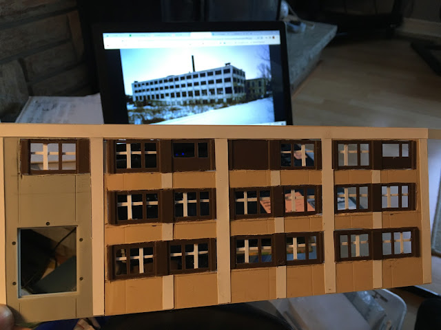
It was a bit of a struggle to get the windows built. I inserted the station kit windows, but it looked like an apartment building, so I had to add mullions and grilles. I also added cardstock mullions/pilastres (choose your architectural term) vertically and at top, horizontally, with a prototype photo for guidance:
As with many situations in life, a coat of paint can surely improve things. The walls are a dirty white, with dark grey window frames. I added acetate for the window glass. I also maximized my parallelogram potential and added three unusually-angled walls from the Promotex kit..
This is the 'inside' wall that will face the spur. With creativity but an economy of effort, I printed out several window images, cutting and gluing them in place.
A trial fit into the available space. Now, to decide on that layout-edge wall...since it's the only one on the layout that intersects the layout edge, I considered building interior scenes. Nah, I eventually thought that might be distracting, so would opt for a dark-coloured wall instead.
Putting the original back, the change seemed to be a positive one! No going back...
I added a Promotex ceiling, and the brown wall was from the second of Michael's kits - a firehouse - and some roof details. The dark colour should make the odd-shaped wall less obvious. I was also careful to make sure the spur had enough clearance to pass between the buildings, slightly adjusting the spur alignment and adding a stopblock. I'm considering adding remnants of the Davis Leather lettering that used to adorn this new, white wall.

Two frequently-asked questions - how much time and money are invested in this hobby? Cost of this build was about five dollars, and just a few hours of enjoyable build time! Reviewing some archival photos of the tannery while it still stood, detail of a 1950 photo showed some of the original painted lettering on the north wall (below). At some point thereafter, the walls were whitewashed.
I thought it would be a neat detail to add. So, I hand-drew some lettering, proportioned to fit my between-window spaces. Then I carefully cut out the letters, glued them on, traced around them, then removed the paper (below) and weathered the wall. Fortuitously, some of the white paint peeled off, leaving an interesting weathered effect:
The final weathered look, with the lettering barely still visible:

Some photos of the tannery in place. I added a floor to the shipping-door area:
But wait...what about the smokestack that dominated the area between Rideau Street and the Cataraqui River, along with that of the former smelter? Needed! I used a train-show find
Walthers smokestack, that I'd previously used for the Vermont iteration of my layout's Howe Scale Co. It's about half as tall as the prototype smokestack, but I like the detail and it will definitely call attention to the tannery as a major 'smokestack' industry!
There are two ways to paint brick-and-mortar, and I've tried both. One is to paint the entire structure the mortar colour, then paint the bricks. The other is to paint the entire structure the brick colour, then flood in dilute paint for the mortar. I tried both, starting from the top with the former technique (more successful), and from the bottom with the latter, using various shades of hobby paint:
I painted the top black to represent soot. I dry-brushed the bricks, usually vertically. It depends on the feedstock being used, and I always try web-brushing, dry-brushing, working horizontally and/or vertically, whatever gives the best results. At first I wasn't hoppy with the overly-bright, spotty look of the painting (above). I wanted a variable brick colour. I used dilute paint to highlight the mortar in too-dark areas, and coloured penciles to colour the too-light areas, vertically.
Satisfied with the result, I planted the smokestack behind the tannery (above) on a small base, in case I wanted to move it (unlikely) or in case I knocked it over during switching operations (more likely!).
To quote my late father-in-law's generalized expression of approval, that's "good leather, well-tanned".


